這系列文章為參考Google本身文件讀者本身對其之瞭解所做的筆記,如果有錯的地方麻煩順手讓我知道一下瞜~感謝
Goals
Create a visual language that synthesizes classic principles of good design with the innovation and possibility of technology and science.
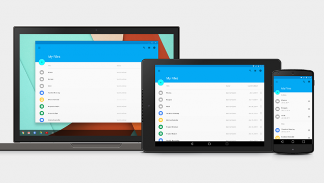
Develop a single underlying system that allows for a unified experience across platforms and device sizes. Mobile precepts are fundamental, but touch, voice, mouse, and keyboard are all first-class input methods.
Material Design主要提供科技產品建置一跨平台與裝置的設計準則,目標再讓所有平台或裝置有同一的操作體驗,包括顯示、觸控、聲音等都在其範圍內。
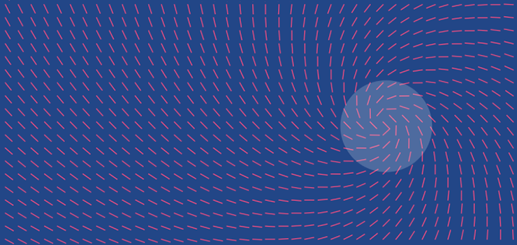
Principles - Material is the metaphor
The fundamentals of light, surface, and movement are key to conveying how objects move, interact, and exist in space in relation to each other. Realistic lighting shows seams, divides space, and indicates moving parts.
物件的光影、形狀、介面都能表達出與周遭環境的互動的情形,如同手指去波動水面會造成水面漣渏但在空氣中卻不會,合理的動作與物件顯示即可釋出彼此目前的關係。
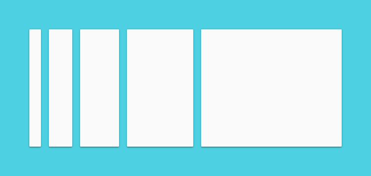
Principles - Bold, graphic, intentional
An emphasis on user actions makes core functionality immediately apparent and provides waypoints for the user
不需透過多的設計或誇張的顯示,僅需透過簡單的色彩、空間與形狀等搭配來建立出使用者應該走的方向是Material Design主要想強調的。
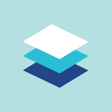
Principles - Motion provides meaning
All action takes place in a single environment. Objects are presented to the user without breaking the continuity of experience even as they transform and reorganize.
這句就是最精隨的一段,無須破壞一個連貫活動的任一動作,因為那就是最真實的呈現。
感想
Google 所提倡的Material Design與Apple先前所提的Flat Design有一個絕大的不同點,在於物件相關性與合理性。
同於Flat Design簡單的強調一個準則 - simplicity,不要讓過多的加工破壞了原本物件存在的用意與原先的設計,設計應該強化在創造更佳的體驗。
但Material Design更強調物件與物件本身之關聯,沒有東西會憑空出現,事出必有因,所以在物件與物件之前的關聯上做了一些規範來實作出了這一些概念,包括了控制光影、物件顯示的表面與動作行為等。除此之外也提出,因為必須讓事物有跡可循所以”它”就有自己的規矩,不見得每個人都能夠任意使用,對於設計師來說「限制」是有必要的。
正如Google CEO Matias Duarte先前訪問時所提出的Mobile is dead,其中一段
If you’re product is about finding a ride, it’s not okay that you can get it on a 7-inch screen but not on a 2-inch screen.
這句話大概最能解釋Material Design所希望達成的目標。但不僅是Google想定義出底下各產品設備,網頁或app等有一個一樣的視覺感受,它同時也在撫平與連貫跨裝置的操作理念。